One of the key elements of creating great products is listening to customers and users. So this round of updates is all about usability and interface enhancements that we noticed when partnering with you to see how you explore the app.
New Sidebar Design & Homepage:
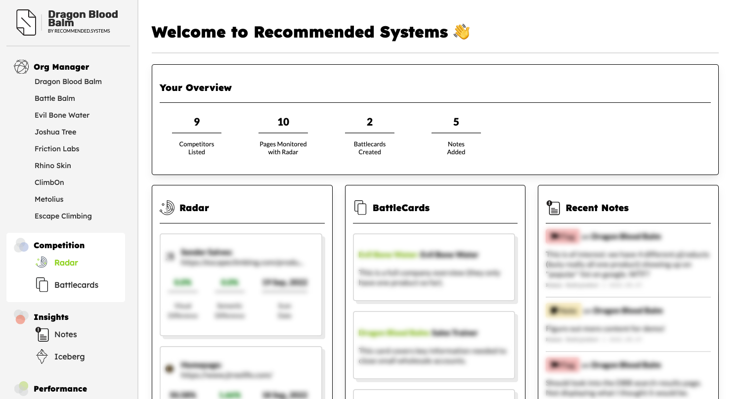
Firstly, we've revamped the sidebar design! We wanted to make it clearer and easier to understand what each capability was far, and when you'd want to explore it.
So Radar and Battlecards are now grouped under "Competition", while Notes and Iceberg services are grouped under "Insights".
We've also created a "overview" of your activity on the main page. The homepage is where you should be able to see all of your most relevant and recent information in one glance, and we're excited to explore this further!
Notes: Expanded Functionality
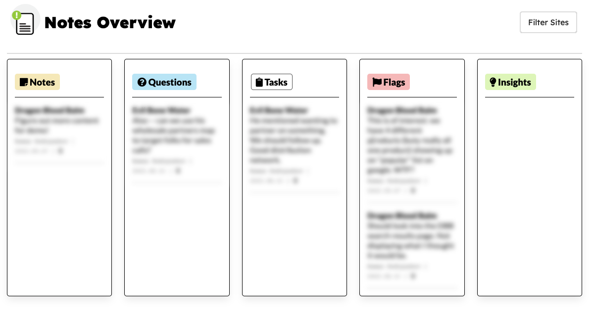
We've expanded the Notes capabilities to have their own dedicated page. Now you can see all of your notes by type, and filter them by organization as well.
Next up, you'll be able to turn your tasks-related notes into actual to-dos for the team, and pin certain notes to the top of a column so that they don't get lost.
Radar: Add Notes Directly to Page Scans
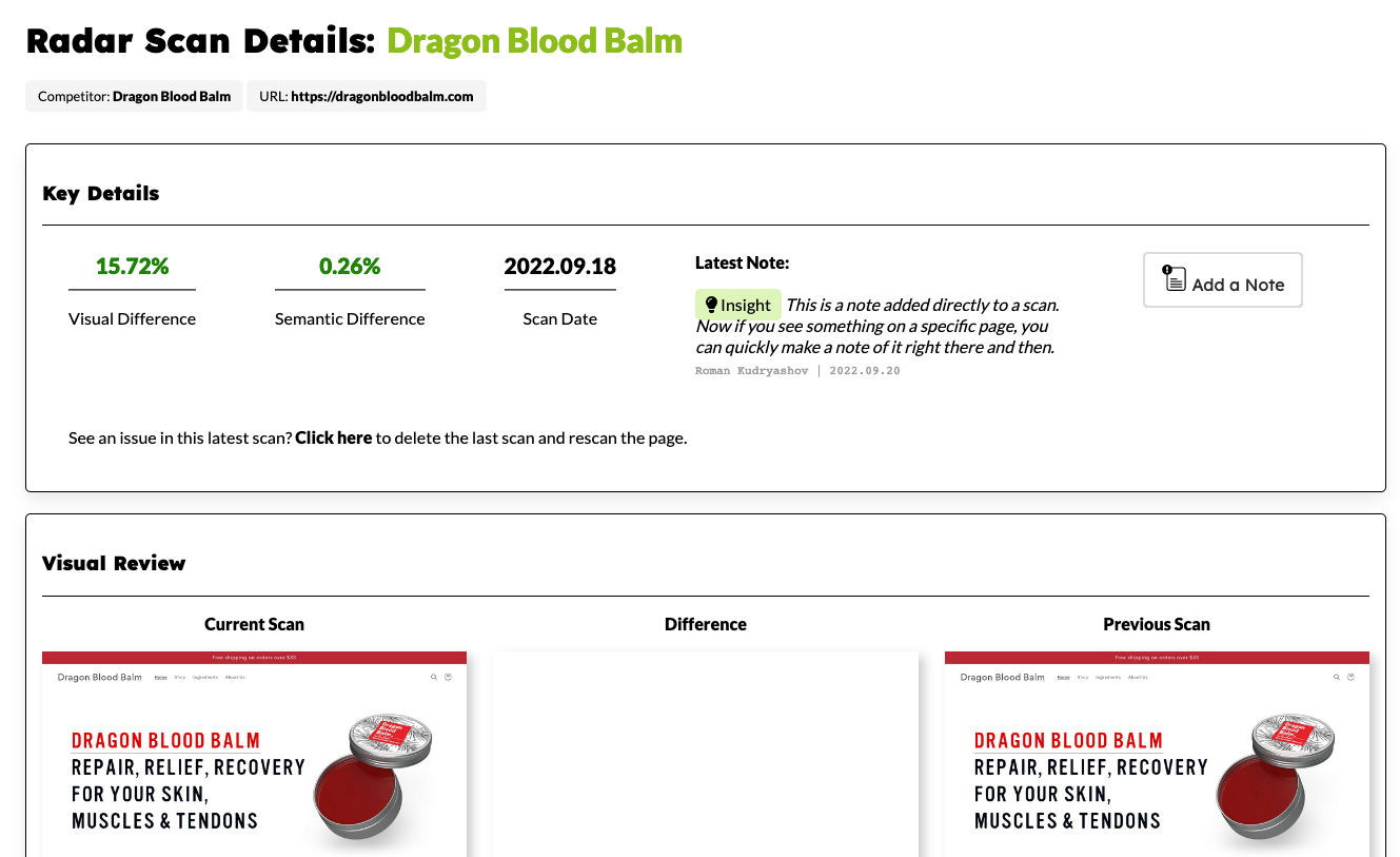
Requested by quite a few people, you can now add notes directly to a scanned page. This makes it easier to jot down thoughts and tasks when you're reviewing the data. And, when these notes show up in the larger collection of notes, you'll be able to see what company and page it was referencing, and jump directly to it. We're still exploring the best design for this, as well as annotating the scans themselves. Hang tight!
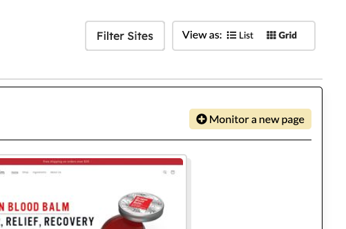
We've also made it easier to add a page to monitor directly from the Radar overview page. Just click on the yellow "Monitor a new page" button to get started:
New Plan Limits!
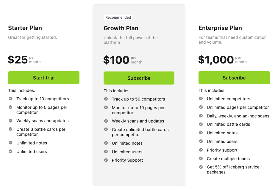
As we talked with everyone, we quickly learned that most companies are looking at 5-10 competitors in their space. Our lowest tier was at 5 competitors and everyone felt like they were only monitoring a fraction of their market. So we've changed up the options to make it more in line with how a company thinks about their markets. Our new plans start at 10 competitors on the starter and trial tiers:
We're also excited to announce that we're opening our Beta to everyone! If you're interested in signing up, just go to our homepage and click on the "Create a Free Account" button. We're keeping our plans free while in still in Beta, so take advantage of it while it lasts!
That's it for this week.
As always, we're excited to hear your feedback and ideas. Don't hesitate to reach out to hi@recommended.systems if anything comes to mind.
